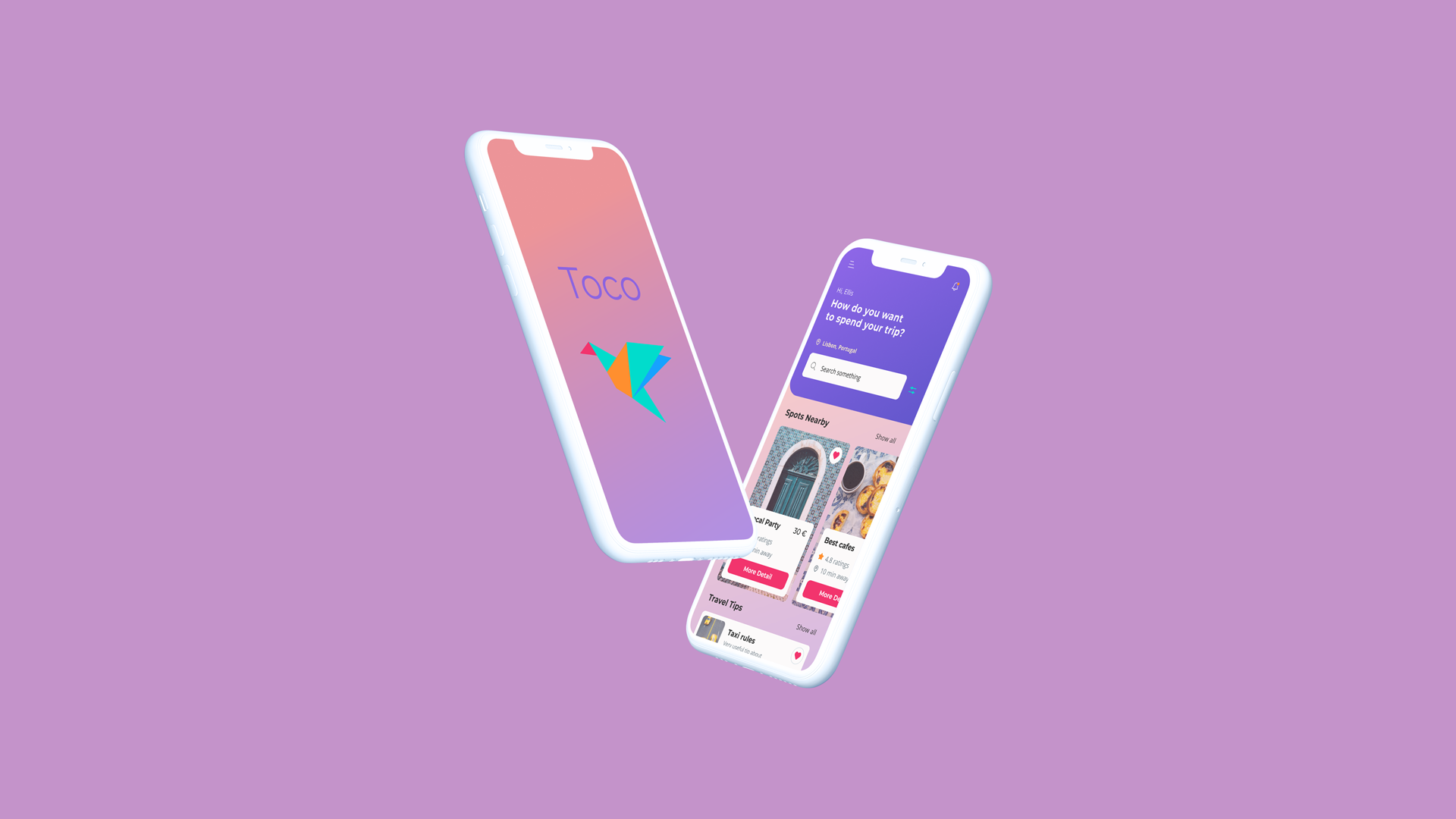
Plan less, experience more
Find local ideas
for your next trip
Role
UX/UI designer
Why another travel app? 🏄♀️
Most travel tools drown you in lists or lock you into fixed itineraries. Toco asks how you want to spend your time, then builds a simple plan you can adjust on the fly.
Project at a glance:
• Personal concept app exploring local-first trip planning
• Role: UX / UI design, user flows, prototypes, responsive landing page build
• Stack: Figma, HTML, CSS, JavaScript
01.-
Discover
Is there a lack of travel apps? 🧐
01.-
Discover
Why Gen Z and millennials? 😺
Gen Z and millennial travellers take frequent short trips and plan everything on their phones. They want places that feel local and unique, but still safe and easy to reach. Toco focuses on this group because they expect quick planning, trusted recommendations, and a way to ask questions before they go.
02.-
Discover/Define
What people say? 👩🦱🧔
02.-
Discover/Define
📝 Research plan and interview notes
For user interviews, I found participants who travel 🧳 a lot for different reasons, either with their partners or alone. All interviews were conducted over video calls and included a short introduction, the interview itself, and a brief debrief at the end.
BACKGROUND:
The travel industry has changed radically since 2008, when startups such as Airbnb and Uber
were founded. The rise of low-cost airlines in the 2010s also played a significant role in
reshaping ✈️ the way people travel.
Nowadays, travellers can easily find a safe taxi from an airport to their apartment. Once
they arrive at their 🏡 accommodation, they do not need to go through a tedious hotel
check-in process. Most Airbnb apartments offer a self-check-in box 🔑 and, by the time our
traveller has had a shower or bath, a local food 🥡 delivery service is already at the door
with a tasty lunch.
Millennials and Generation Z appreciate comfort 😸 and the feeling of becoming locals from
the moment they land in a new city. The only thing missing from this “comfort + local
experience” combo is an app that helps them quickly find suitable, targeted places that are
recommended and verified by locals.
02.-
Discover/Define
🔍 Affinity map & findings
After the interviews, I transcribed the main points into notes and turned them into an
affinity map.
Each interview had its own colour (yellow, orange or green). I wrote the key points on
sticky notes, sometimes summarising longer comments. In a few cases, I also sketched small
drawings 🖍 to better understand each user’s goals.
Then I grouped the notes into six
recurring motives:
1. Local experience 🍜 (local food and local places)
2. Transport 🛵 (renting a car, using public transport, issues with public transport)
3. Trip research 🗺️ (paper maps vs Google Maps, research about unsafe areas)
4. Tickets 🎫 and discounts (ISIC card, buying tickets before visiting museums)
5. Travel services 🛋️ (hotels, Airbnb, TripAdvisor)
6. Travel behaviour 👭 (travelling alone or with a partner, choosing between comfort and
price)
03.-
Discover
Is it a unique idea? 🧐
03.-
Discover
Competitors research 👩🏼💻
I analysed more than twenty travel and local discovery apps using a checklist covering
sign-up flow, search and filters, reliability, personalisation, and how “local” the
experience felt. For each product, I went through the full onboarding, captured key screens,
and logged pros and cons.
Direct competitors such as Cool Cousin, Trip.com, Withlocals and Foursquare confirmed the
value of strong search and categorisation, but showed friction around forced registration
and generic “local tips” that often looked like tourist lists or sponsored picks. Indirect
products such as TikTok and Dice suggested patterns to borrow: fast personalisation,
lightweight feeds, and a smooth flow from browse to booking.
From this analysis, I defined three design rules for Toco: let users explore before creating
an account, focus on verified recommendations from locals rather than generic lists, and
keep prices transparent and competitive, with free or low-cost options highlighted where
possible.
04.-
Define
From stressed planner to relaxed traveller 🧳
04.-
Define
Travellers Toco is built for ✈️
From the interview research, I defined two core traveller types for Toco.
Kätlin is a 24-year-old student who takes city breaks on a tight budget. She wants clear
safety basics and a quick way to find authentic places without spending evenings lost in
blogs and reviews.
Luis is a 32-year-old senior software engineer who works remotely and stays longer in each
city. He looks for liveable neighbourhoods and reliable spots to work, eat and meet friends,
without juggling dozens of maps and notes.
These two personas guided the user flow and helped decide which features to keep simple,
automate, or leave out of the app.
05.-
Define
From wish list to must-have features 📱
05.-
Define
🗂 Card-sorting & MoSCoW prioritisation
Card sorting research took 2 days, and it involved 8 participants (from Europe, the UK, and
the US; generation Z and millennials). Participants had an option to sort cards into
3 columns: 😺 must-have, 👌 nice to have, and 🗑 rubbish. They also had a choice to keep
some cards unsorted.
📍 Card sorting showed what most respondents wanted to see in the Toco travel app:
1. Section 🥂 “Restaurants recommended by locals”
2. Filter places 💶 by budget
3. Section ❤️ "Saved places"
4. Section ⛲️ "Spots nearby"
5. Filter places by topic
6. Section 🤫 "Untold rules"
7. Section 🎡 "Things to do"
8. Function "Add friend to your trip"
These results fed directly into the MoSCoW map, where I grouped features into must have, should have, could have, and will not have for the first release.
06.-
Define
💡 From insights to MVP
06.-
Define
📝 Findings and project goals
User interviews, persona work and feature prioritisation all pointed in the same direction:
travellers want a simple way to feel like locals without spending evenings comparing blogs,
maps and reviews.
For this project, I defined four main objectives:
1. Create a simple, user-friendly travel app with recommendations approved or made by
locals.
2. Reduce the time users spend researching before and during a trip.
3. Keep users informed about unsafe areas, local “untold rules” and practical risks in the
city.
4. Support a small community around alternative, non-touristy ways of travelling.
07.-
Develop
✏️ From first sketches to user feedback
07.-
Develop
Sketch prototype in action 📱
To create the lo-fi prototype, I sketched the main screens in Procreate using an Apple Pencil, then imported them into Marvel to build a clickable flow for quick testing. For the first round of testing, I invited the same three people who took part in the user interviews. Two participants tested the prototype during a Zoom call (sharing their screens), and one tested it in person. I took notes throughout and did a short debrief with each person afterwards.
📍 Results:
1. All participants used the “Skip” button during onboarding.
2. None of them understood what the “Locals Q&A” section was for.
3. Everyone was positive about the like button and the feed in general.
4. These findings shaped the next version of the product: simplifying onboarding, rethinking
the “Locals Q&A” section, and keeping the like button as a core interaction.
📍 Link to low-fidelity prototype
08.-
Develop
📱 Final screens and how people reacted
08.-
Develop
High-fidelity prototype and testing 👩🏼💻
For the hi-fi prototype, I followed a UI guideline 🎨 that I had created earlier for a web design course. I designed the interface in Figma and also used it to organise my UX research documentation. For prototyping, I built a clickable hi-fi flow and used the Figma Mirror app so participants could test it on their phones.
For the second usability test, I invited the same people who took part in the user
interviews.
One participant tested the prototype during a Zoom call 📱 (sharing their screen), and one
tested
it in person on their own phone.
📍Results:
1. All participants used the “skip” button.
2. The overall flow was clear, and the interface felt intuitive.
3. The logo and some titles were partially hidden by the iPhone notch, so this needed layout
adjustments for the next iteration.
00.-
Finish
🎉Project reflections🎉
For me, Toco was a way to stress-test a fairly ambitious idea: a travel companion that
brings together trusted local recommendations and safety tips in one place. Taking it from
interviews to card sorting, personas, prototypes, and usability testing helped me practise
the full UX process and see how each phase affects the product.
If I picked up Toco again today, my next steps would be:
1. Validate the concept with a larger and more diverse group of travellers to see how the
value
proposition should evolve.
2. Redesign onboarding and the information architecture around two clear promises: feeling
safe
in a new city and feeling like a local, then retest the flow without confusing elements such
as the “locals QA” section.
3. Define how local content would actually be created and moderated in the real world,
including partnerships, editorial guidelines and ways for travellers to report new tips.
Even if Toco never launches as a real product, this project shaped how I approach
research-driven design and how I test ideas quickly before investing in full builds.