Role
UX/UI designer
Project Type
Personal Website
0
%Session time growth 💻
0
%Page views growth 👩🏼💻👨🏻💻
01.-
Empathise/Define
Context
This project started as a UX audit of an existing portfolio site for an independent
designer-developer. He wanted to refresh his website before applying for new roles, as the
previous version had not been updated for about five years.
After an in-person meeting to clarify his goals and priorities, the UX audit showed that a
full redesign would work better than incremental changes. I was brought in as the UX/UI
designer for the new site, with the challenge of presenting both his development work and
his graphic design projects clearly on one platform.
All case study materials published here were reviewed and approved by the client.
01.-
Empathise/Define
🔑 UX challenges
📍UX needs and goals:
💎 Make the website easy to understand and use from the first visit.
💎 Keep navigation simple, clear and predictable.
💎 Highlight the client’s skills and experience in both web development and graphic
design.
💎 Give visitors a quick way to reach relevant project pages.
💎 Find an effective way to present two types of projects: web development and graphic
design.
01.-
Empathise/Define
🎨 UI challenges
📍 UI needs and goals:
💎 Define a visual style that feels bold and slightly provocative, while still remaining
professional and not off-putting.
We explored several style directions together to find an approach that expresses his
personality and also filters out companies that are not a good fit. The portfolio needed to
look confident and distinctive without becoming aggressive, so that hiring teams focus on
his skills and experience rather than only on the visual concept.
💎 Incorporate his portfolio in both web development and graphic design within one coherent
interface.
💎 Use different layouts and content blocks for development case studies and graphic design
projects, while keeping the overall system consistent.
💎 Include dark mode as a core feature of the interface.
01.-
Empathise/Define
💻 Development challenges
📍Development needs and goals:
💎 Align the new design with the existing front end stack based on Bootstrap 4.
💎 Reuse Bootstrap’s responsive grid and components instead of redesigning them from scratch,
while keeping the layout visually distinct.
💎 Support a single page Vue.js application with smooth in page navigation between project
sections.
💎 Build the hi fidelity prototype on a 12 column grid (65 px columns, 30 px gutters) to
match the framework’s layout system.
💎 Add clear comments and annotations in the prototype to simplify development and
handoff.
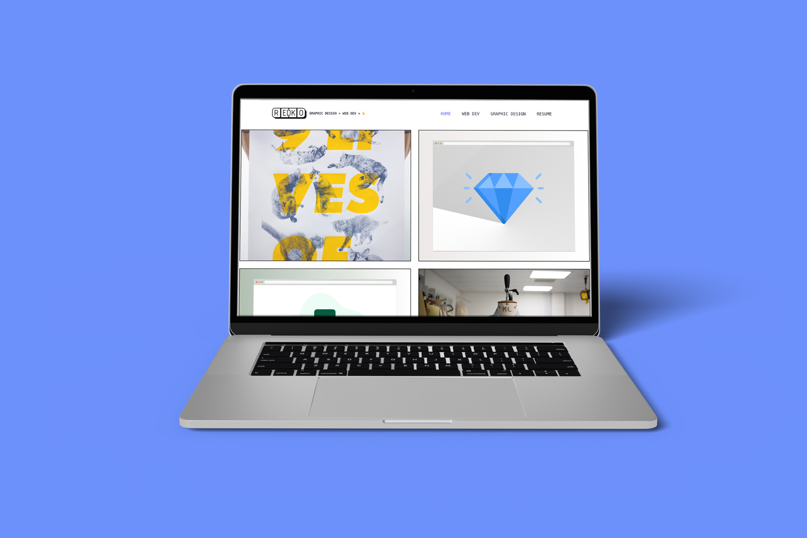
02.-
Research
✏️ Website sketches
Moving forward, I could have started from many different directions, but I chose to begin with quick website sketches. I drew a series of key screens that reflected the client’s goals, content priorities and navigation needs, without looking at other portfolio sites yet. Once I had several options on paper, I researched how other developers and digital designers present their work online, using this as a benchmark rather than a source to copy. This kept the focus on solving my client’s problem instead of reproducing someone else’s layout.
02.-
Research
Moodboard
After sketching the first layouts, I analysed more than 20 portfolio websites from
developers and designers. I created a moodboard, grouping screenshots into three categories:
UI solutions, project descriptions, and key features.
The review showed that my client had some specific goals, but that proven patterns from
other portfolios were still useful. I selected a shortlist of example sites to discuss with
him and took notes during that session to capture his preferences for structure, tone, and
visual style.
02.-
Research
👾 Sitemap & affinity mapping
The next step was to create a sitemap that supported the design goals. One unusual decision
was to send visitors straight from the home page to the projects section. This reflected the
client’s main aim: helping recruiters and potential collaborators reach the work as quickly
as possible.
At the same time we had to decide what to do with the CV and About content. It was not clear
at first whether these sections should stay separate or be combined. I ran a short
affinity-mapping exercise with the client to group content and priorities, which helped us
decide how to structure these pages.
We also agreed on a visual direction that combines minimalism with a few sharper,
characterful details. Generous negative space keeps the content readable and lets the key
information stand out while still leaving room for bolder elements in the layout.
03.-
Design/Prototype
✒️ Wireframes
The next step was to reshape the homepage. I explored several layout options, moving towards
a more minimal solution. The logo, name and role stayed on the home screen, while I tested
different ways to introduce projects and navigation.
A key decision was whether the main menu should stay visible on the homepage or appear only
once a visitor moved to the projects
section. After a round of quick wireframes for both the homepage and the project page, I
chose the option that kept the page clean while giving visitors a direct route to the work.
03.-
Design/Prototype
🎨 Fonts and UI guideline
After agreeing the wireframes, the next step was to finalise typography and the visual system. I prepared several font pairings and we reviewed how they worked across headings, body text, and small UI labels before choosing the final set. Based on these decisions I created a compact UI guideline with colour tokens, type scale and basic components, which we then used as the reference for hi-fi prototyping and developer handover.
03.-
Design/Prototype
Handoff
We ran three rounds of design reviews with the client, followed by moderated usability
testing on the new site. I recruited four participants with different backgrounds. During
testing, three out of four users struggled with scrolling on the home page, so I reduced the
height of the project cards to a maximum of about three quarters of the viewport.
After releasing the updated layout, analytics for the new website showed a clear
improvement: session time increased by around 140% and page views by about 350% compared
with the previous version. The full UX and UI design process, from audit to handoff, took
roughly two months.
04.-
Evaluate
🎉 Results 🎉
We conducted 3 rounds of the website feedback sessions and I moved to the last phase:
testing the client's website. For this stage, I recruited users of different age and
background. During the 💻 user testing, it became obvious that the size of project cards on
front page should not take more than 3/4 of window height because
3 out of 4 users reported having problems with the navigation.
The whole design and development process took a month and 👩🏼💻☕️ countless cups of
coffee.